SUMMARY:
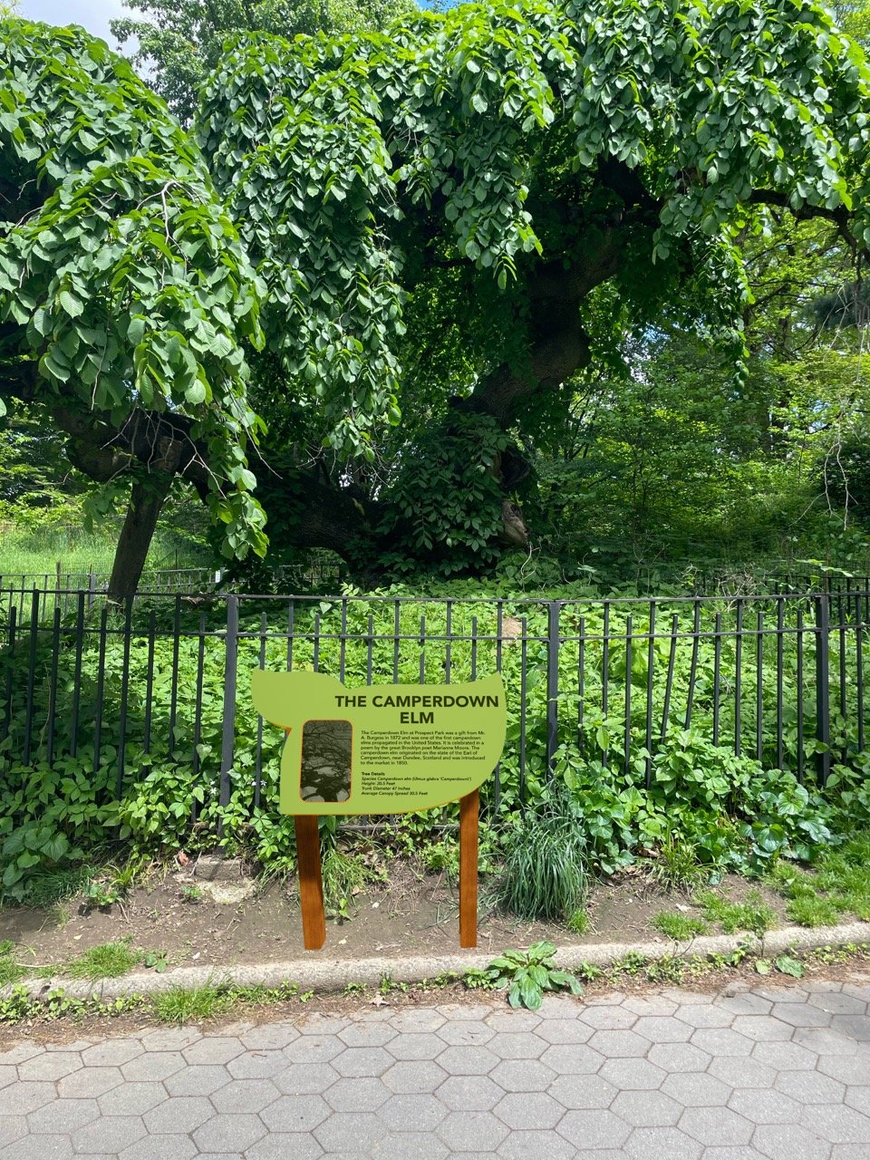
Tasked with choosing and redesigning a park wayfinding system, I chose the historic Prospect Park in Brooklyn, New York. The goal of this redesign was to create signage that is clear, fun, and easily legible for all. The signs designed include identification, directional, orientation, regulatory, and interpretive.
The signage was created with the intention of making navigation easy for all visitors, regardless of language or age. Bright, vibrant colors ensure the signs are easily identifiable, enhancing both safety and the overall experience. I aimed to design a wayfinding system that not only serves a functional purpose but also highlights the beauty of the park, standing out rather than blending into the background. An application was also developed to help visitors discover all the opportunities available to them while exploring the park.
PROCESS:
The first step in redesigning the Prospect Park wayfinding system was identifying the weaknesses of the existing signage. After evaluating the park’s overall signage needs I created zones to help with location identification and explored materials capable of withstanding years of weather exposure. With this research completed, I was able to design signs that are both visually appealing and functional for all park visitors.


PROGRAMS:
SketchUp.
Adobe Illustrator.
Adobe Photoshop.
Twinmotion.